#css menu hover effects
Explore tagged Tumblr posts
Visit Tumblr Blog
Explore Tumblr blogs with no restrictions, modern design and the best experience.
Last Seen Tumblr Blogs


Fun Fact
Kazakhstan’s Minister of Communications and Informatics has blocked the Tumblr site because it contained 60 sites of terrorism, extremism, and pornography in 2015.
Photo

CSS Menu Hover Effects
#css menu hover effects#html css menu#CSS Tricks#basic html css tutorial#pure css animation#css animation examples#css menu#html#css#webdesign#divinector
3 notes
·
View notes
Photo

Creative CSS Dropdown Menu Hover Animation
#Pure CSS Menu#css menu hover effects#pure css dropdown menu#css dropdown menu#dropdown menu hover animation#css animation examples#css#html#html5#css3#animation#frontend#frontenddevelopment#codingflicks
2 notes
·
View notes
Photo
Navbar with Box Shadow Effect For more visit codenewbies YouTube channel
#css menu hover effect#css menu hover#css menu#html css menu#css navbar#css tricks#codenewbies#navbar
0 notes
Photo
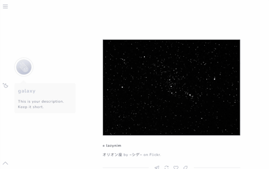
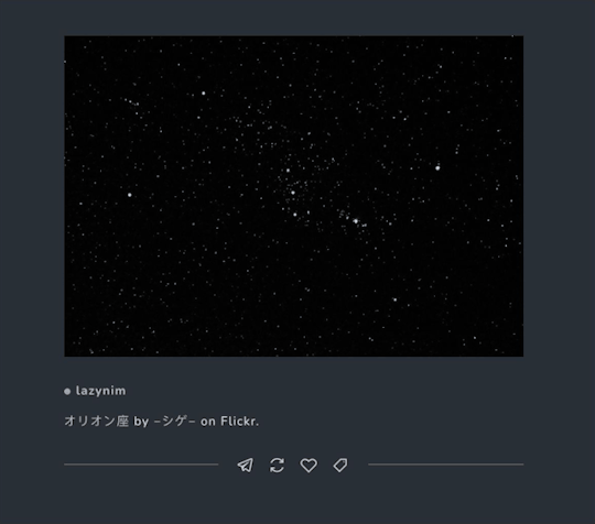
galaxy by mercurythms
preview | download
features:
minimal sidebar with optional icon
customizable font choices (google fonts) and sizes
adjustable post and sidebar width
slide-out navigation menu with search bar
optional night mode button (night mode can stay one while switching pages!)
optional updates tab
option to show tags always or hide them
responsive for desktop and mobile devices
credits:
base code - @seyche
line awesome icons
responsive videos - @nouvae
css photosets - @annasthms and @eggdesign
mobile photoset fix 2.0 - @glenthemes
night mode button - @eggdesign
custom like and reblog button inspired by @shythemes
minimal soundcloud player - @shythemes
hover effects - ian lunn
tippy.js tooltips - atomiks
fade in effect - cory laviska
remove tumblr redirects - @magnusthemes
customization tips:
font choices can be found on google fonts
icon shapes can be found on the line awesome web page if you wish to change any
night mode colors can be altered within the root variables of the code and the accent color can be changed on the customization menu
Please do not remove credit or steal parts of this code. Please message me if you have questions or encounter problems with this theme.
1K notes
·
View notes
Photo
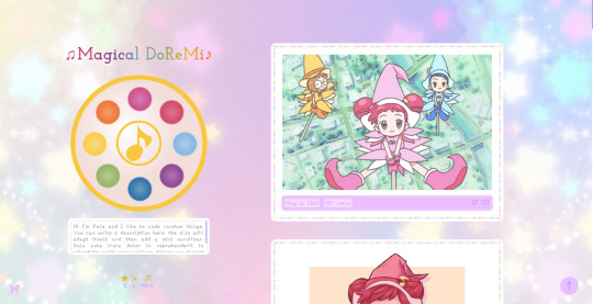

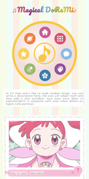
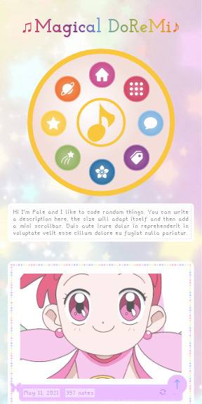
Magical DoReMi by palemona
preview 1 | preview 2 | code
Please follow my new blog @themesbypale
Hi there! I remembered how I loved the anime Ojamajo Doremi as a kid, so I made this theme as a little tribute. Hope you like it!
General Features:
Responsive: looks good in all screen sizes.
Navigation Menu is the first Magical Tap from Ojamajo Doremi, if you hover the circle buttons with the cursor an icon will appear.
Custom Background: it can be an image or color, and you can change the repeat behaviour, position and size of the background.
Custom color accents.
Rainbow effect tittle (you can disable it).
Choose between seven cute fonts, and you can choose a different font for the title and for the posts.
Change fonts sizes.
Four custom links.
Go to top button.
Nice musical cursor (you can disable it).
Choose between one or two columns layout.
Popup window with a mini about section and a infinite tags list.
Notes
If you don’t add an image in the popup the text will just adapt.
In mobile version the tap will position on the top of the page, and the icons will be shown by default.
If you want to enable de mobile version, you have to go to advanced options of the theme and disable the option “use default mobile theme”.
In cellphones the posts will be shown in 1 column by default.
If you disable the rainbow tittle it will be of the accent color.
For the infinite tags, in the Edit Theme bar there is a textbox called “Tag List”, you have to enter there a list of links and names separated by comas, first the url and then the name of the tag, witn no blank lines. Example: https://palemona.tumblr.com/tagged/theme, a theme tag, https://palemona.tumblr.com/tagged/other, other tag, https://palemona.tumblr.com/tagged/nicetag, a nice tag
You can add any number of tag as you want and the popup will adapt to the tags.
This also works for more custom links if you want to add more.
If you want to change the default icons in the menu you will need a little html knowledge, if you want to do it sent me a message.
The tumblr theme editor sometimes is buggy, so if the color buttons aren’t shown in the edition mode or something looks weird is normal, in your tumblr will look fine.
Credits
Basecode by @seyche
Default background img by @cocorini
All icons are from cappuccicons.com by @suiomi
Script for css circles inside a circle by Itay grudev
Lovely multicolor dots border made by my friend Daniel Dorantes
Full list of credits in the code.
Feel free to use it, if you have any questions or something is not working well please contact me.
I will be doing more themes, if you’re curious please follow me and if you like this theme please reblog and like! :)
#theme#tumblr theme#tumblr themes#free theme#kawaii theme#ojamajo doremi#magical doremi#cute theme#palemona#themehunter#codingcabin#shojo anime#magical girl
419 notes
·
View notes
Note
Hi im just learning to code and was wondering how you made the underline on your tumblr wiggle. I have been looking everywhere.
I'm using an svg animation to create it! The svg code for the wiggly line is the source for the background image. It functions the same way an <svg> tag would so I can change the stroke width, color, and add some CSS animations. This is a better explanation on how that works.
It'll be easier if you're familiar with SVGs and CSS animations, so make sure you read up on that if you're feeling lost. Also it was easier to include my svg background in an external stylesheet than trying to include it with the rest of my theme.
There's also underline hover effects and menu hover effects from codrops that are fun to experiment with!
#answered#svg code can get bulky#definitely dont want that taking up a lot of your css if you can avoid it
16 notes
·
View notes
Text
‘Toggle Tumblr controls’ tutorial using jQuery
Hi everyone, I made this tutorial as a request by @phantasyreign , hope you’ll find it usefull :3 to follow this tutorial you must have some html, javascript (with some jQuery) and css knowledge. Anyways I’ll try to make it as clear as possible.
1. Add the lastest jQuery release (3.6.0)
jQuery is a javascript library to write javascript code more simple. There is a very important note here. jQuery comes in 4 different “forms”, you can find it:
uncompressed
minified
slim
slim minified
The uncompressed version includes ALL the functionality of jQuery, included AJAX functionalityy and animation effects.
The slim version doesn’t have this functionalities to make it lighter. I remark this point because depending of which version you use, the toggle animation will look different, so in case you are already using jQuery in your theme, consider the result that the button will have.
PD: the minified version is the same as the uncompressed but with all the code is compressed without blank spaces to make it even more lighter, same happens with the slim minified version.
With the slim minified version (which is the one I’m using in this tutorial) the animation will look like this:
And the uncompressed version will look like this:
You can choose any version you want, the uncompressed version by the way has more animations effects you can explore, and the slim version just has the function “toggle” to hide and show elements (which is the one we’re going to use).
Having this clear let’s continue. So we add jQuery inside our <head> tag <script src="https://code.jquery.com/jquery-3.6.0.slim.min.js" integrity="sha256-u7e5khyithlIdTpu22PHhENmPcRdFiHRjhAuHcs05RI=" crossorigin="anonymous"></script>
2. Add an icon library
This is optional if you want that your button will display an icon. You can use any icon library you want like fontawesome, bootstrap icons, CAPPUCCICONS icons, feather icons, etc. In this tutorial I’m using Bootstrap Icons. So inside our <head> tag again, we add the following <link rel="stylesheet" href="https://cdn.jsdelivr.net/npm/[email protected]/font/bootstrap-icons.css">
3. Add a button
In this tutorial we’re going to add a button independent of the navigation menu, so place the button inside your <body> or <main> tag.
<button type="button" class="controls_tumblr"><i class="bi bi-gear"></i></button> And then let’s add it some style in our css (inside your <style> tag): .controls_tumblr { all: unset; color: yourcolor; cursor: pointer; margin: 10px; font-size: 1.2rem; transition: all 0.5s ease; position: fixed; top: 0; right: 0; }
.controls_tumblr:hover { color: yourcolor; }
The ‘.controls_tumblr’ class is to remove all the default styles for the button (all: unset), you can customize as you wish this part. The ‘.controls_tumblr:hover ‘ is to make the button change the color when the cursor is hover the button. If you want your button to be inside your navigation menu or in your footer is okay too, just add the button code where corresponding and remove the fixed positioning in the css.
4. Add css to hide the controls by default
Also inside your <style> tag, add the following css:
.iframe-controls--desktop.tmblr-iframe--unified-controls { margin-top: 30px; display: none; height: 54px !important; }
The margin is for the controls don’t overlap our button, and the display: none is to hide by default our controls. The height is the default tumblr controls height, we add it again because it sometimes gets buggy with using display: none to hide the controls, and the page renders without assigning a height to the controls so the controls won’t show when we click the button.
5. Add the jQuery functionality
Inside your <head> tag, add a <script> tag with the following:
<script> $(document).ready(function(){ //toggle controls $('.controls_tumblr').click(function(){ $(".iframe-controls--desktop").toggle( "slow" ) }); }); </script>
If you’re already using jQuery just add the code below //toggle controls right after your $(document).ready function. The function “toggle” will hide and show your controls using the css attribute "display". The parameteter “slow” will do the transition smooth, if you don’t add it the controls will appear and dissapear without a transition. And that’s all! :3 If you have any questions please send me a message.
26 notes
·
View notes
Text
FEATURE SPOTLIGHT: Website Builder
Next-gen website builder that anyone can use. Intuitive, powerful & fast - perfect for non-techies. With Station Builder, you can turn any idea into a reality.

Drag & Drop Editor
Best website builder for non-techies - No coding skills? No web-design experience? No problem! Our innovative visual builder empowers any user to create awesome, modern websites.
Global Styling
Ever wanted to change all the similar colors in your web page with a single click? With Station's page builder, you can! Not only that, but you can change all texts that share the same properties in one go, as well.
Customizable Zero Code Templates
Each template design has been crafted by our world-class design team at Ivory Adler Design House, and can be customized to fit your brand. Every template design supports all major content types, including pages, galleries, blogs, commerce, calendars, and more.
Pre-Built Layouts
Build a page using pre-designed structures for specific purposes such as Contact, About, Blog, Portfolio, Products, and more. Page elements are arranged to quickly create professional layouts and showcase your content. Add or remove blocks to create a custom look.
Duplicate Pages and Content
Easily duplicate pages and other content for testing purposes, or to speed up your website building process.
Design Tools
Station offers flexible layouts, custom color palettes, Google and custom uploaded fonts, free high quality images through Unsplash, built-in photo editing capabilities, video and background banners, and more.
Design Panel
With hundreds of customizable settings, including fonts, colors, animations, and padding, every Station website can be made to look unique with just a few clicks.
Mega Menu
Super useful for header menus that are complex and multi-columned.
Copy/Paste & Styles
Copy and paste content from within your pages. Works with styles too.
Autosave
Never lose your draft work again! The Autosave option allows for save versioning.
Editing History
Go back to a previous state with our Undo functionality. Or, redo steps to work faster.
Global Blocks
Changes are made once and all the edits done to these global blocks will be automatically pushed to all instances, dramatically reducing the time spent on making changes.
Reorder Blocks
Drag-and-drop between live representations of your blocks to reorder your content.
Mobile Responsive
Fully customize the Tablet and Mobile views with changes that are applied independent of the Desktop version. 3 different viewports are available – Desktop, Tablet & Mobile - each canvas with its own options, so you can build a unique mobile experience.
Animations
Bring motion and interactive beauty to your pages with super-fluid and modern animations - On-entry effects, scroll reveals, hover interactions, and Lottie animations.
Shape Dividers
42 shape dividers to add creative transitions between blocks of content, by using the top and bottom divider options.
Custom CSS
Custom CSS can be applied to any site through our built-in custom CSS editor, which also provides image and font file storage for CSS assets.
#buzz#sitebuzz#saas#coaches#platform#launch#unveils#launches#launching#coming soon#business#bossbabe#entrepreneur#startup#founder#website#the station#station sites#marketing#social media#feature#feature list#stationfeature#main feature#publication
1 note
·
View note
Text
A Guide In Firefox to New And Creative CSS DevTools
Over the last few years, our team at
Firefox
has been operating on new CSS gear that address both cutting-edge strategies and age-old frustrations. We’re the Layout Tools team, a subset of Firefox Developer Tools, and our quest is to improve the modern-day internet layout workflow.
The internet has seen an first-rate evolution inside the final decade: new HTML/CSS functions, browser improvements, and design strategies. Our crew is dedicated to constructing gear that fit that innovation so that designers and developers can harness extra of the performance and creativity that’s now possible.
In this guide, we’ll proportion a top level view of our seven new equipment, with memories from the design system and realistic steps for trying out each tool.
1. Grid Inspector
It all started out three years in the past while our CSS format expert and dev advocate, Jen Simmons, labored with members of Firefox
DevTools
to construct a device that would aid customers in examining CSS Grid layouts.
As one of the most powerful new functions of the cutting-edge internet, CSS Grid had quick gained decent browser adoption, but it still had low internet site adoption. There’s a steep studying curve, and you nevertheless need fallbacks for sure browsers. Thus, part of our purpose turned into to help popularize Grid by way of giving developers a more hands-on manner to research it.
The middle of the device is a grid outline, overlaid at the page, which facilitates devs visualize how the grid is positioning their elements, and the way the layout modifications once they tweak their styles. We introduced numbered labels to identify each grid line, the capability to view up to 3 grids at once, and colour customization for the overlays. Recently, we also introduced support for subgrid, a modern day CSS specification implemented in Firefox and hopefully in extra browsers soon.
Grid Inspector changed into an idea for all of the tools that followed. It was even an notion for a brand new team: Layout Tools! Formed in late 2017, we’re unfold across 4 time zones and collaborate with many others in Mozilla, like our rendering engine builders and the best parents at MDN.
TRY OUT THE GRID INSPECTOR
In Firefox, go to our Grid example site.
Open the Inspector with Cmd + Shift + C.
Turn on Grid overlay through one of 3 ways:
Layout Panel:
In the Grid section, check the checkbox subsequent to .Content.Grid-content;
Markup View:
Toggle the “grid” badge next to ;
Rules View:
Click the button next to display:grid; inside
#page
-intro .Grid-content;
Experiment with the Grid Inspector:
Change the crimson overlay coloration to red;
Toggle “Line numbers” or “Extend strains infinitely”;
Turn on greater grid overlays;
See what takes place while you disable grid-gap: 15px in Rules.
2. The Editor of Form Path
The next project we have been working on has been the Shape Path Editor: our first visual editing tool.
CSS Shapes permits you to define shapes for textual content to drift around: a circle, a triangle, or a many-sided polygon. It can be used with the clip-path assets which permits you to trim elements to any of those equal shapes. These two techniques collectively open the opportunity for a few very specific graphic design-stimulated layouts.
However, creating these sometimes complicated shapes can be difficult. Typing all the coordinates manually and the use of the right CSS units is error-inclined and some distance eliminated from the creative mind-set that Shapes allows. Therefore, we made a device that allows you to edit your code through at once clicking and dragging shapes on the web page.
This kind of feature—visible editing—became new for us and browser tools in general. It’s an instance of how we will go beyond inspecting and debugging and into the world of design.
TRY OUT THE SHAPE PATH EDITOR
In Firefox, go to this web page at the An Event Apart website.
Open the Inspector with Cmd + Shift + C and pick out the first circular image.
In Rules, click on the icon subsequent to the shape-outside property.
On the web page, click on the factors of the shape and notice what happens while you drag to make the shape massive or tiny. Change it to a size that appears exact to you.
3. Text Reader
We have had a Fonts panel in Firefox for years which displays an informative list of all the fonts used in a website. We decided to convert this into a Font Editor to fine-tune the properties of a font by continuing our trend of designing in the browser.
A driving force behind this assignment become our purpose to support Variable Fonts at the same time that the Firefox rendering engine team changed into adding support for it. Variable Fonts gives font designers a way to offer fine-grained variations alongside axes, like weight, within one font file. It also supports custom axes, which offer each font creators and web designers an exceptional amount of flexibility. Our device routinely detects these custom axes and offers you a manner to alter and visualize them. This would otherwise require specialized websites like Axis-Praxis. Additionally, we added a characteristic that gives the ability to hover over a font name to spotlight in which that particular font is being used at the page. This is helpful because the manner browsers select the font used to render a bit of text can be complex and depend upon one’s computer. Some characters may be abruptly swapped out for a special font due to font subsetting. TRY OUT THE FONTS EDITOR
In Firefox, go to this variable fonts demo site.
Open the Inspector with Cmd + Shift + C and pick out the word “variable” within the title (the element’s selector is .Title__variable-web__variable).
In the 1/3 pane of the Inspector, navigate to the Fonts panel:
Hover over the font name Output Sans Regular to look what receives highlighted;
Try out the load and slant sliders;
Take a take a look at the preset font versions within the Instances dropdown menu.
4. Flexbox Inspector
Our Grid, Shapes, and Variable Fonts equipment can together electricity some very advanced graphic layout at the internet, but they’re still somewhat present day based on browser support. (They’re nearly there, however still require fallbacks.) We didn’t need to work most effective on new features—we were drawn to the problems that maximum web builders face on a every day basis.
So we started work at the Flexbox Inspector. Design-wise, this has been our most ambitious assignment, and it sprouted some new consumer research strategies for our team.
Like Grid, CSS Flexbox has a fairly steep learning curve while you first get started. It takes time to truely recognize it, and a lot of us hotel to trial and error to gain the layouts we need. At the beginning of the assignment, our team wasn’t even sure if we understood Flexbox ourselves, and we didn’t recognize what the main challenges have been. So we leveled up our understanding, and we ran a survey to discover what human beings wanted the most when it got here to Flexbox.
The outcomes had a big effect on our plans, making the case for complicated visualizations like grow/decrease and min/max. We continued operating with the community at some point of the task by means of incorporating remarks into evolving visual prototypes and Nightly builds.
The tool consists of two main parts: a highlighter that works just like the Grid Inspector’s, and a detailed Flexbox device inside the Inspector. The middle of the tool is a flex item diagram with sizing info.
With help from Gecko format engineers, we have been able to show the step-by-step size choices of the rendering engine to offer users a full image of why and the way a flex object ended up with a positive size.
Note: Learn the full tale of our design manner in “Designing the Flexbox Inspector”.
TRY OUT THE FLEXBOX INSPECTOR
In Firefox, visit Mozilla’s Bugzilla.
Open the Inspector with Cmd + Shift + C and pick out the element div.Inner (simply inside the header bar).
Turn on the Flexbox overlay through one of 3 ways:
Layout Panel:
In the Flex Container section, turn on the switch;
Markup View:
Toggle the “flex” badge next to ;
Rules View:
Click the button next to display:flex.
Use the Flex Container panel to navigate to a Flex Item known as nav#header-nav.
Note the sizes shown within the diagram and length chart;
Increase and reduce your browser’s width and see how the diagram modifications.
Interlude: Doubling Down On Research
As a small team and not using a formal person research support, we’ve regularly resorted to design-by-dogfooding: basing our critiques on our personal stories in using the tools. But after our achievement with the Flexbox survey, we knew we wanted to be better at collecting statistics to guide us. We ran a new survey to assist tell our subsequent steps. We crowdsourced a list of the 20 largest demanding situations faced by internet devs and asked our community to rank them using a max-diff format. When we discovered that the huge winner of the demanding situations was CSS Layout Debugging, we ran a follow-up survey on unique CSS insects to discover the largest pain points. We supplemented these surveys with user interviews and user testing. We also asked folks to rank their frustrations with browser developer tools. The clear pinnacle difficulty became moving CSS modifications returned to the editor. This became our subsequent project.
5. Changes Panel
The difficulty in shifting one’s work from a browser developer device to the editor is one of those age-old issues that we all just got used to. We were excited to make a easy and straight away usable solution.
Edge and Chrome DevTools got here out with versions of this device first. Ours is centered on assisting a wide range of CSS workflows: Launch DevTools, trade any patterns you want, and then export your modifications by means of either copying the overall set of changes (for collaboration) or simply one changed rule (for pasting into code). This improves the robustness of the whole workflow, such as our other format tools. And this is just a start: We recognize accidental refreshing and navigation from the web page is a huge source of facts loss, so a manner to bring persistence to the tool may be an essential next step. TRY OUT THE CHANGES PANEL
In Firefox, navigate to any website.
Open the Inspector with Cmd + Shift + C and pick an element.
Make some adjustments to the CSS:
Modify patterns inside the Rules pane;
Adjust fonts within the Fonts pane.
In the right pane of the Inspector, navigate to the Changes tab and do the following:
Click Copy All Changes, then paste it in a text editor to view the output;
Hover over the selector name and click Copy Rule, then paste it to view the output.
6. Inactive CSS
Our Inactive CSS feature solves one of the top troubles from our layout debugging survey on precise CSS bugs: “Why is this CSS assets now not doing anything?”
Design-wise, this feature is very simple—it grays out CSS that doesn’t affect the page, and shows a tooltip to give an explanation for why the property doesn’t have an effect. But we understand this can enhance efficiency and cut down on frustration. We have been bolstered by research from Sarah Lim and her colleagues who constructed a similar device. In their studies, they observed that novice builders had been 50�ster at building with CSS when they used a device that allowed them to ignore beside the point code.
In a way, that is our favorite sort of feature: A low-placing UX fruit that barely registers as a feature, however improves the complete workflow without actually wanting to be determined or learned. Inactive CSS launches in Firefox 70 but may be used now in prerelease variations of Firefox, consisting of Developer Edition, Beta, and Nightly. TRY OUT INACTIVE CSS
Download Firefox Developer Edition;
Open Firefox and navigate to
wikipedia.Org;
Open the Inspector with Cmd + Shift + C and choose the center content material area, called central-featured;
Note the grayed out vertical-align declaration;
Hover over the data icon, and click on “Learn extra” if you’re interested.
7. Accessibility Panel
Along the way we’ve had accessibility functions developed by means of a separate group that’s typically one person — Yura Zenevich, this year together with his intern Maliha Islam.Together they’ve turned the brand new Accessibility panel in Firefox into a powerful inspection and auditing tool. Besides displaying the accessibility tree and properties, you could now run different varieties of checks on a page. So far the checks include shade contrast, textual content labels, and keyboard attention styling.
Now in Nightly, you can strive the new shade blindness simulator which harnesses our upcoming WebRender tech.
TRY OUT THE ACCESSIBILITY PANEL
Download Firefox Developer Edition;
Navigate to
meetup.Com;
In the developer tools, navigate to the Accessibility tab, and click the “Turn on Accessibility Features” button;
Click the drop-down menu subsequent to “Check for problems” and pick out “All Issues”;
Take a have a look at the diverse contrast, keyboard, and text label troubles, and click the “Learn greater” links if you’re interested.
Next Up
We’re currently hard at paintings on a browser compatibility tool that uses facts from MDN to expose browser-specific problems for a particular element. You can follow along on GitHub to learn extra. The Future
We’re committed to helping the modern-day web, and that means continuously converting and growing. New specs get implemented via browser vendors all of the time. Guidelines and nice practices around progressive enhancement, responsiveness, and accessibility evolve constantly. Us device makers need to hold evolving too.
And what of the long-lived, ever-present troubles in creating the web? What ordinary user interfaces need to be rethought? These are a number of the questions that preserve us going!
What approximately a better manner to navigate the DOM tree of a page? That a part of DevTools has gone essentially unchanged since the Firebug days.
We’ve been experimenting with functions like again and forward buttons that might ease navigation between lately visited elements. A extra dramatic trade we’re discussing is including a compact DOM view that makes use of a syntax much like HTML templating engines. The attention could be on the most common use case—navigating to CSS—as opposed to viewing/enhancing the source.
We’ve additionally been thinking about a higher element selector. We realize how it can be more effective to work inside the web page, with much less jumping backward and forward into DevTools. We should make the detail selector extra effective and greater persistent. Perhaps it could choose whitespace on a page and tell you what causes that space, or it can shed mild at the relationships between extraordinary elements.
As a reputed Software Solutions Developer we have expertise in providing dedicated remote and outsourced technical resources for software services at very nominal cost. Besides experts in full stacks We also build web solutions, mobile apps and work on system integration, performance enhancement, cloud migrations and big data analytics. Don’t hesitate to
get in touch with us!
Source:
whizzystack.co
#b2b ecommerce
#b2b content marketing
#b2b seo
#b2b marketing blog
1 note
·
View note
Photo

theme 09 — coral a theme for codingcabin's pantone color of the year challenge
preview, code (alt.)
features:
custom circle cursor
3 sidebar types
popup menu
popup post info
search bar
jump pagination, infinite scroll, or load more
credits:
icon font: @suiomi
modified css photosets: @annasthms and @espoirthemes (x)
infinite scroll: paul irish
smoothscroll
page loader: Vijaya Kumar Vulchi (x)
menu link hover effect: codrops (x)
more info
terms of use | likes + reblogs are appreciated! | let me know if there are any problems
#itsphotoshop#yeahps#theme hunter#codingawards#theme#tumblr theme#a: theme#anna.html#mine#a: coral#I was going to do much more with this then ran out of time :/#oof there’s probably so many bugs ugh#im really proud of the cursor tho I worked so hard for it#the preview is probably a mess ill fix that sometime#let me know if there’s any bugs! please!#posting this at 11pm lmao
955 notes
·
View notes
Photo

CSS Creative Menu Hover Effects
#css menu hover effects#html css menu#menu hover animation#menu html css#css animation examples#css animation tutorial#pure css animation#html#css#CSS tutorial for beginners#divinector
2 notes
·
View notes
Photo

Responsive Navbar HTML CSS Only
#navbar css#responsive menu#responsive webdesign#responsive navbar#menu css#css menu hover effects#css tricks#html css#css animation#menu html css#css tutorial#learn to code#codinglife#codingisfun#codingdays#frontendfriday#frontend#webdesign#codingflicks#animation
1 note
·
View note
Photo

CSS Menu Hover Effect
#css menu hover#css menu#hover effect#css hover animation#menu html css#html css#css animation#css animation examples#css animation tutorial#codenewbies
0 notes
Photo
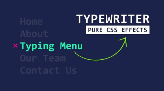
CSS Text Typing Menu Item Hover Effects | CSS Typewriter Animation ☞ https://bit.ly/2xnX1vU #CSS #Morioh
#css#css crash course#html css#css3#css tutorial#css for beginners#css beginners#css course for beginners#codequs#morioh
2 notes
·
View notes
Photo

Firefox 70 is here
#414 — October 23, 2019
Read on the Web
Frontend Focus
Firefox 70 Released — The latest release includes a handful of interesting CSS changes, such as the display property now accepting two keyword values (for setting both inner and outer display types), password generation for input type='password' fields, improved underline styling, and more. There's also the usual Firefox 70 for developers post outlining all the key changes in a bulletpoint fashion.
Mozilla
Focusing on Focus — Focus behavior in Web browsers has been in flux and under-specified for years. Efforts are now underway to clear up some of the confusion (particularly around Shadow DOM and autofocus) and begin to firm up the specs “to hopefully make focus in HTML make sense to browser engineers and web authors”.
Rakina Zata Amni (WHATWG)
Frontends Without Backend with FaunaDB Auth + Native GraphQL — FaunaDB is a globally distributed, scalable database. Thanks to built-in security and native GraphQL, frontends can directly communicate with FaunaDB in a secure way which eliminates the need to pass through a backend and greatly reduces latency.
FaunaDB sponsor
The "P" in Progressive Enhancement Stands for "Pragmatism" — Demonstrates how using progressive enhancement with CSS can be used to build things up gradually. “With a Progressive Enhancement mindset, support actually means support. We’re not trying to create an identical experience: we’re creating a viable experience instead.”
Andy Bell
Can We Please Style The <select> Control? — Highlights issues developers are facing when working with the the built-in <select> element, and what efforts are being undertaken to hopefully improve it.
Greg Whitworth
Style Hover, Focus, and Active States Differently — Why you should (and how to) style hover, focus, and active states differently.
Zell Liew
💻 Jobs
Frontend Developer at X-Team (Remote) — Work with the world's leading brands, from anywhere. Travel the world while being part of the most energizing community of developers.
X-Team
Have You Tried Vettery? — Vettery specializes in tech roles and is completely free for job seekers. Create a profile to get started.
Vettery
📙 Articles, Tutorials & Opinion
Making Tables Responsive with Minimal CSS — When creating table-based layouts you may be tempted to implement some sort of custom grid-system or pull in a pre-built library. The author argues against this, recommending using just “tables and some simple CSS”.
Bradley Taunt
Box Alignment and Overflow — Runs through a data-loss issue you may face when using box alignment properties in certain scenarios, and highlights how the 'safe' overflow alignment keyword can help prevent such a loss.
Chen Hui Jing
State Management for Flutter Apps with MobX — Learn how to use MobX to ease state management on a Flutter project.
CircleCI sponsor
How to Design Delightful Dark Themes — Plenty of practical tips here on how to design dark themes that are “readable, balanced, and delightful”.
Teresa Man
Options for Hosting Your Own Non-JavaScript-Based Analytics — Rounds-up a range of alternatives to Google Analytics.
Chris Coyier
The 'Perfect' Responsive Menu — Here’s how to create a menu that is accessible and works across mobile and desktop browsers without any duplication.
Polypane
JAMstack Tools and The Spectrum of Classification — An overview of JAMStack services and tools, along with some notes on their pros and cons.
Chris Coyier
The React Hooks Guide: In-Depth Tutorial with Examples. Start Learning
Progress KendoReact sponsor
An Introduction to Regular Expressions for Web Developers
Chris Achard
🔧 Code, Tools & Resources
Peaks.js: Interact with Audio Waveforms — A client-side JavaScript component to display and interact with audio waveforms in the browser. Here’s the related GitHub repo.
Indrek Lasn
TinaCMS: A Site Editing Toolkit for Modern React-Based Sites — An open-source real-time site editing toolkit currently aimed at Gatsby and Next.js users.
Tina

Open Doodles: A Collection of Free CC0 'Sketchy' Illustrations — You can even generate a set with your own custom colors (as above).
Pablo Stanley
Typetura: Fluid Typesetting — We linked to this responsive typography tool when it was in beta earlier this year, and now it’s generally available (paid). It'll help set up text transitions between breakpoints — here’s a demo of it in action.
Typetura
▶ A Realistic 'Water Effect' with Just HTML & CSS — A very convincing effect using the <feTurbulence> SVG filter. Here's the code.
Red Stapler
🗓 Upcoming Events
VueConfTO 2019, November 11-12 — Toronto, Canada — The first ever Vue Conference in Canada.
Chrome Dev Summit, November 11-12 — San Francisco, USA — A two-day summit to learn about the latest from Chrome, plus techniques for building the modern Web. Note: Registrations are now closed, but the event can be joined remotely.
Performance Now, November 21-22 — Amsterdam, Netherlands — A single track conference with fourteen speakers, covering the most important web perf insights.
HalfStack Conf, November 22 — London, UK — A single day event focused on UI-centric JavaScript and web development.
Frontend Con, November 26-27 — Warsaw, Poland — Brings together 30+ experts with over 500 experienced frontend pros from all over the world.
dotCSS, December 4 — Paris, France — The largest CSS conference in Europe.
by via Frontend Focus https://ift.tt/2Jgg4vc
3 notes
·
View notes
Text
TWEAKING YOUR TUMBLR THEME: A CRASH COURSE
i know css/html and code my own themes. one side effect of this is that every so often i encounter someone—a friend or a friend’s friend, usually—who has installed a new theme and is now struggling to customize or tweak it without knowing how to go about doing that.
now i’m always happy to help out, but these are always things that take just a few minutes to figure out if you can read the code and, well, give a man a fish or teach a man to fish. you know how it goes.
so here we go: this is how to fish.
PART ONE: UNDERSTANDING CSS & HTML
let me lead with this: it is normal to feel confused, overwhelmed, intimidated, stupid, and/or frustrated when working with an unfamiliar coding language. my father has been writing software for forty years, but he will look at what is to me a page of very basic css/html and be completely baffled by it all the same. this is normal. please don’t let it discourage you if you feel this way at first.
in my opinion, the first step to conquering these feelings is to wrap your brain around the big picture of what these languages do. what do we use them for?
well, all web pages — and thus, all tumblr themes — are written in these two languages. the only thing you need to know for our purposes is this: html holds the content of a web page, and css controls its appearance.
how does this work?
a webpage is built of html objects called <div> tags. think of them like bricks: you stack a bunch of <div>s on top of each other and bam! you have a house. but it’s a terrible house, because it’s just a pile of bricks with stuff scribbled on them.
this is where the css comes in. a <div> tag can have a unique id or belong to a general class, and we use css to style the appearances of our <div>s on a per-id and per-class basis. to return to our housebuilding metaphor, css is our blueprint: it gives order, structural stability, and aesthetic coherence to our messy pile of bricks, and now, bam! we have a house. for real.
PART TWO: THE SYNTAX
coding languages are like human languages in that they have their own unique vocabulary and grammar. to tweak a tumblr theme, you need to have a basic grasp of this syntax so you can understand what you’re looking at.
css manipulates objects called elements. usually, an element is the id or class of a <div>, but an element can correlate to any html tag. the basic anatomy of a css element goes like this:
selector { property: value; }
and we can translate this into english as “when the element this selector is looking for occurs, it will look the way i have described it here.”
selectors might look like this: h1 { or #id { or .class {
the distinction between these different types of selectors is not important for our purposes. all you need to know is that the selector corresponds to (or selects) a particular html tag, like: <h1>, <div id = "id">, or <div class="class">.
properties are the visual features of an element, like its height, width, color, and so on, and the value is a statement that describes the desired setting for the property. a property-value statement is called a declaration, and a collection of declarations is called a declaration block.
you can generally figure out what a declaration is doing by looking at the name of the property, since they’re pretty self explanatory most of the time. for example, font-size: 12px; says that any text contained in this element is going to have its size set such that a character is 12 pixels tall.
[ sidebar: if you are a Tiny Font person, consider using the knowledge you’ve gained from this tutorial to edit your theme such that the text of all your posts is very small, and then don’t use small text or sub/superscripts in your replies. you’ll get the Tiny Font aesthetic on your blog with perfect consistency, without rendering your posts illegible on the dashboard. ]
PART 3: MAKING YOUR CHANGES
the key to quickly and easily modifying a tumblr theme is to be able to identify the name of the css selector for the element you want to modify. let’s look at my own theme as an example.

depending on what changes you want to make and how the theme’s creator laid out their code, you may not have to do much work at all to get the selector.
for example, if you want to do something with your theme’s pagination buttons, it’s a pretty reasonable guess that the css selector will be something like “pagination_next” or “pagination_prev”, and you can go straight to the html editor and do a ctrl+F search for “pagination” to find it.
but what if the selector isn’t immediately obvious? for the purposes of this example, let’s say i want to change the text of the blog description from red to dark blue (while preserving the red color of other elements in the theme, which precludes simply using tumblr’s in-built color picker.)
i could just scroll through the theme code until i found a selector that looked like the one i wanted, and then change something and update the preview & repeat ad nauseum until i found the right one. but again, depending on how the theme’s creator did their coding, this might be very difficult, frustrating, and time consuming. many prolific tumblr theme creators don’t lay out their code in a particularly human-readable way.
fortunately, there is a much easier way.
step 1: load your tumblr and right-click somewhere on the page. depending on what browser you use, the exact name of what you’re looking for will vary, but the keyword to look for is “inspect”:
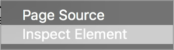
click this.
(if you are using safari, you need to make sure “show develop menu” is checked in the advanced tab of the preferences window.)
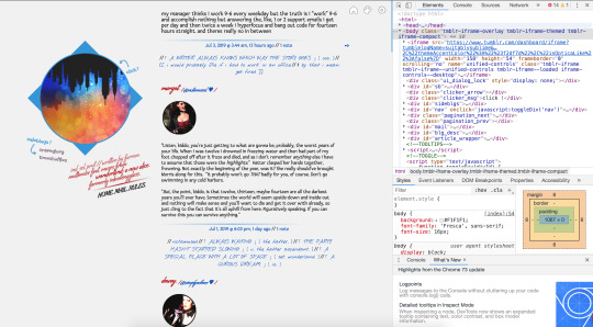
step 2: your screen will now look something like this:
if the element you want to change is in a popup or tab, open it so it’s visible on the screen.
step 3: the topmost box in the inspector displays all the html of your theme. if you hover over an html tag, the corresponding element will be highlighted in blue.
find the <body> tag. you may need to expand this manually depending on your browser. move your mouse down the line of divs until you find the element you want to modify.
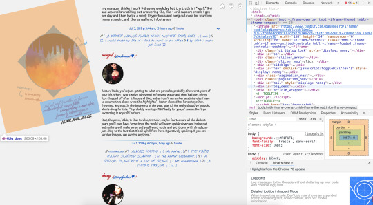
here, my mouse is hovering over <div id="blg_desc"> in the inspector, and you can see how the blog description is shown in a blue rectangle. (the large orange shape shows the size of the element’s margins.)
this tells me that the css selector for this element is #blg_desc.
step 4: close the inspector and open tumblr’s theme customization interface. go to edit html. ctrl+f to find the css selector:
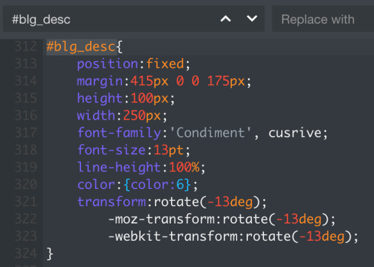
now, my goal is to change the text color, so the declaration i’m interested in is color:{color:6};. the {color:6} value is an object tumblr uses to store colors in a theme as an alternative to using rgb or hex codes (like #B61818, which is the shade of red i have stored in {color:6}. these objects correlate to the color picker under theme options:

thus, if i change the value of color to {color:1}, the text of my blog description will be blue instead of red. i can also write this as color:#0d52c0;.
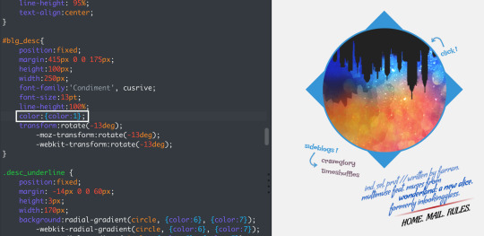
(note that the exact shade of red/blue in my description varies a little from line to line; this is because of styling i did within the html itself that makes some lines transparent, and thus lighter because of the pale grey background.)
& if you use pages with custom html, the inspector trick will of course work for them too.
PART FOUR: IN SUMMARY
remember that css/html is not magic. it might feel intimidating, but at the end of the day it’s just a language for translating human thoughts like “i want a small purple square” into instructions a computer can understand, like this:
#ps { height: 100px; width: 100px; background-color: #8c4c7a; }
and all you need to do to make the changes you want is 1) identify the css selector and 2) understand the properties you’re manipulating. 1) is the difficult part, because everybody lays out their selectors differently—but using the inspector will allow you to instantly identify selectors by sight. and once you have that, 2) is super easy, because properties are standard and intended to be readily legible to humans.
you may occasionally run into tricky properties, like for example display or position, which do things that are a little more abstract / not immediately obvious. for those cases, refer to the w3schools css dictionary for clear, simple, but still comprehensive explanations for proper usage.
#⌈ A WRITER ALWAYS KNOWS WHICH WAY THE STORY GOES ⌋ ( ooc. )#[[ for real though i love helping people but#99% of the time when i get asked for help#it's easy little things that#because of a lack of understanding#have bred so much unnecessary frustration#& i just.#you CAN learn and there IS a better way ]]
3 notes
·
View notes